Showing posts with label bespoke. Show all posts

Wednesday, 14 March 2012

On the (book)mark

Inspired by their love of literary greats, the bride and groom wanted to reflect a bit of their passion for reading in the design of their wedding. As the invitation tends to act as an introduction of the wedding look and feel, we created a bookmark invitation to announce this theme. With one side in English and the other in German, each guest's name was written on the invitation. Grey and white striped twine adorned the invitation and a grey envelope lined in a pop of orange completed the invitation suite.


Monday, 13 February 2012

Happy V-day

Could there be a more love-ly message to receive on V-day?

Thursday, 9 February 2012

A lovely thank you

Hand-written thank you notes are a special thing, but even more so when received from a client and penned on an R+J bespoke design. Featuring a special moment of their wedding day, this letterpressed notecard contained slits on the front of the card, allowing a photo to featured on the card design. The photo could then be removed and kept as a keepsake at a later point. With their custom logo featured on the card and on the liner, this design was complete.

Wednesday, 1 February 2012

On trend

With the spring trends of pretty pastels and powder pink colours appearing in shops, our recent invitation design for a Bat Mitzvah seems quite appropriate. This letterpressed invitation, RSVP card and flat notecard featured colour combos fit for a young girl, while sophisticated patterns and font choices allowed the design to feel modern. The hand-lined envelope allowed for a fun pop of colour to appear and introduce the recipient to the feel of the celebration. In a chilly London town, these colours bring a bit of warmth.


Thursday, 22 December 2011

Happy and merry

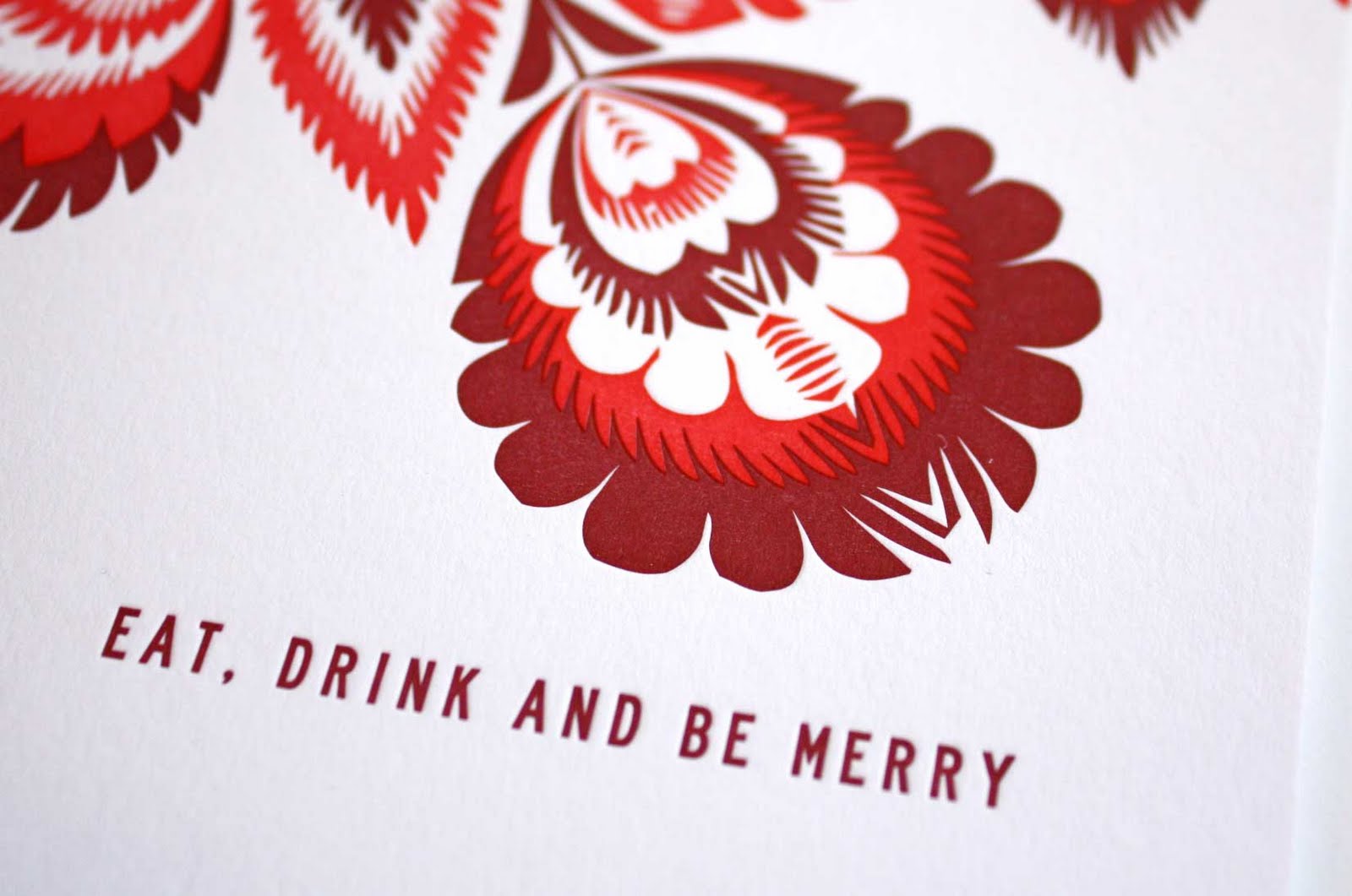
As we prepare to pack up the studio for the Christmas holidays, we wanted to share our final bespoke card for the year. Featuring a vibrant pattern and a message of holiday cheer, this folded letterpress card is sure to help one feel jolly. And the thoughts of 'eating, drinking and being merry' are dancing around on our minds as well. Merry Christmas!


Wednesday, 5 October 2011

In the Press!

We were so pleased to be featured in the September/October issue of Brides magazine. The pages are always full of great, colourful ideas for weddings and we were lucky enough to be one of them! Featured was a menu and place card design which featured a custom monogram of the couples' initials. Have a peek...

Wednesday, 14 September 2011

In celebration

Full of excitement about their recent engagement, this couple wanted a vibrant invitation in which to celebrate their upcoming marriage. The typography was a clean and simple design, while the colours and patterns were punchy and graphic. The envelope was lined in a solid green colour chosen from the design and the wrap-around address labels incorporated the pattern to add a pop of fun for the recipient.

Thursday, 1 September 2011

Around the world

With backgrounds that span many locations, this couple wanted to highlight areas around the world that held a special place in their hearts. Each location held a lovely story and was featured through the creation of a bespoke map. This folded invitation featured a navy script on the front and the custom map on the back to share their own personal story with their guests.

Thursday, 11 August 2011

A pretty parcel

This invitation suite was full of the couples’ personalities, incorporated a bit texture and featured a lovely colour palette of muted tones that complimented each other so nicely. Inspired by the couples’ nicknames for each other, a logo treatment of a bunny and bear was featured throughout the invitation suite in various forms. Their initials were used throughout the suite and sat alongside a selection of fonts that felt a bit modern, with a touch of formality and loads of personal touches. The entire wedding invitation suite, which included a double sided invitation, an RSVP postcard, a double-sided pre-wedding party and an info card, was wrapped in twine and finished with a tag featuring their initials.

Thursday, 4 August 2011

Introducing Anais...

The arrival of adorable Anais was announced using a soft palette of pastels which surrounded her debut photo. A decorative border added a finishing touch to a special hello to friends and family.

Wednesday, 13 July 2011

A modern invite

Have a look at a recent wedding invitation which incoporated an elegant font and adornment set against a modern use of colour and pattern. The use of letterpress gave it the perfect modern-vintage feel.

Thursday, 7 July 2011

In the press!

We were so pleased to be featured in Living Etc's August issue. A favourite to read every month, the glossy pages are always full of lovely and colourful ideas and this month, we are a part of them! Have a peek...


Wednesday, 22 June 2011

La vie en rose

A milestone birthday deserves an invitation with an impact. Taking inspiration from the location of the party, this invitation was designed the the ‘garden party chic’ theme in mind. Brightly coloured roses adorned the invitation and RSVP and gave the guests a peek into the feel of the surprise party.

Thursday, 2 June 2011

Happy Engagement

An engagement is cause for a big celebration. Rhys and Polly invited their guests to join in the festivities with an invitation that featured the use of a bright colour and a modern heart motif. Happy celebrating!

Wednesday, 25 May 2011

A touch of gold

Taking inspiration from the stunning location of the wedding, this invitation and rehearsal dinner invite introduced the feel of the wedding weekend. This folded invitation featured the couple’s name encased by a decorative border, while the inside invited each guest to join in the celebrations in a traditional script. Both invitations were foil blocked in metallic ink which gave the wedding suite a lovely pop. Each envelope was hand-addressed by Christopher Austin and featured a contrasting colour for an added punch.

Wednesday, 9 March 2011

Well written

An energetic pattern, the use of bold letters and a pop of colour is the perfect recipe for a notecard. Jot a sweet message and pop it in the post!

Wednesday, 2 March 2011

On the guest list

Have a peek at a recent letterpressed invitation created for a fabulous 50th birthday. Not wanting to limit the celebrations to one specific time and date, this invitation was created so the details could be filled in by hand. Having multiple celebrations is the best way to kick off turning 50!