Thursday 22 December 2011

Happy and merry

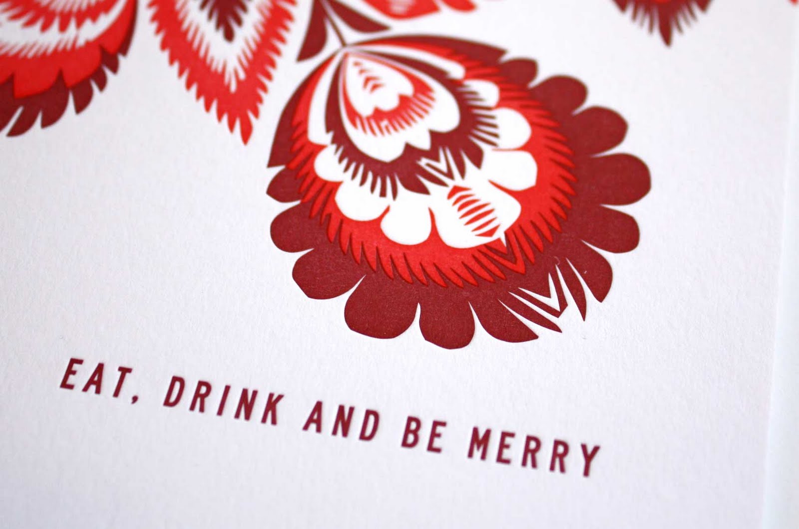
As we prepare to pack up the studio for the Christmas holidays, we wanted to share our final bespoke card for the year. Featuring a vibrant pattern and a message of holiday cheer, this folded letterpress card is sure to help one feel jolly. And the thoughts of 'eating, drinking and being merry' are dancing around on our minds as well. Merry Christmas!


Thursday 15 December 2011

Christmas countdown


Christmas is quickly approaching and we couldn't be more excited. A few of our favourite things during the holidays...take a spin around an ice skating rink, consume copious amounts of Christmas cookies, watch Elf as many times as possible, making our lists and checking them twice and of course writing lovely messages inside Christmas cards. However you spend your holidays, enjoy!

Thursday 8 December 2011

New home

A single-sided announcement featured a Scandinavian floral design as a nod to the sender's heritage. Featuring just a single colour, this letterpressed design was a lovely way to share the details of her new place to call home.

Thursday 1 December 2011

A modern invite

With the wedding taking place in a rural location, the couple were eager to incorporate modern touches to their wedding day. The invitation suite announced this aesthetic and featured a graphic leaf pattern as a gentle nod to the location and decor and the combination of fonts gave an overall contemporary feel. The suite was letterpressed and featured a custom logo that used throughout the wedding decor.

Wednesday 23 November 2011

Giving Thanks

Currently we are giving thanks for inspiring afternoons, coffee, anything salted caramel flavoured, weekends spent wandering, big belly laughs, a nice glass of wine at the end of the day, picking up conversations with old friends right where they left off, sunglasses on any day, rainy day snuggles and, most importantly, wonderful friends and family. Happy Thanksgiving!


Wednesday 16 November 2011

Chock full of wonder

On a recent visit to New York City's Soho neighbourhood, we wandered past a new boutique. Not wanting to miss out on a potentially good find, we pop in to find out a bit more. C wonder is great new addition to the area, offering accessories, homewares and clothing. Full of punchy colours, fun patterns and energetic typography, this boutique left us feeling inspired on a grey day. Have a peek...


Friday 11 November 2011

A lucky number

Happening only once every 100 years, today’s date is one to remember. What a lucky set of numbers and visually a lovely sight as well!

Thursday 10 November 2011

Illuminating

Beautiful type, lovely colours and a sweet saying all make for some nice eye candy this afternoon.

Wednesday 19 October 2011

Eye candy

We were always told not to judge a book by it's cover, but how can you not when the cover design is so adorable? Lovely paper stock, punchy, bright colours and bold patterns adorn these lovely notebooks gifted to us by a friend's recent trip to Italy. The yellow and white stripes are right up our street and are the perfect way to house ideas and doodles.

Wednesday 5 October 2011

In the Press!

We were so pleased to be featured in the September/October issue of Brides magazine. The pages are always full of great, colourful ideas for weddings and we were lucky enough to be one of them! Featured was a menu and place card design which featured a custom monogram of the couples' initials. Have a peek...

Thursday 29 September 2011

Well noted

Incorporating elements from the couple's wedding stationery design, this notecard was created using their custom monogram. Colour edging was featured in a sage green and two version of envelope liners added a pop of personal touches to their letterpressed notecards.


Wednesday 14 September 2011

In celebration

Full of excitement about their recent engagement, this couple wanted a vibrant invitation in which to celebrate their upcoming marriage. The typography was a clean and simple design, while the colours and patterns were punchy and graphic. The envelope was lined in a solid green colour chosen from the design and the wrap-around address labels incorporated the pattern to add a pop of fun for the recipient.

Wednesday 7 September 2011

In Bloom

With London's recent gray days filling up our summer, the first glimpse of sun this past weekend had us racing out for some fresh air minus the umbrella. Petersham Nurseries was the perfect way to spend an afternoon, grazing on delicious cakes while wandering through lovely plants, pottery and other items suddenly on our wishlist for the home. A perfect blend of colours and textures transported us to a chic and inspiring location where one wished they could stay for awhile. This visit was the perfect dose of vibrant colour to carry us through to the next sunny spell...fingers crossed!

Thursday 1 September 2011

Around the world

With backgrounds that span many locations, this couple wanted to highlight areas around the world that held a special place in their hearts. Each location held a lovely story and was featured through the creation of a bespoke map. This folded invitation featured a navy script on the front and the custom map on the back to share their own personal story with their guests.

Thursday 11 August 2011

A pretty parcel

This invitation suite was full of the couples’ personalities, incorporated a bit texture and featured a lovely colour palette of muted tones that complimented each other so nicely. Inspired by the couples’ nicknames for each other, a logo treatment of a bunny and bear was featured throughout the invitation suite in various forms. Their initials were used throughout the suite and sat alongside a selection of fonts that felt a bit modern, with a touch of formality and loads of personal touches. The entire wedding invitation suite, which included a double sided invitation, an RSVP postcard, a double-sided pre-wedding party and an info card, was wrapped in twine and finished with a tag featuring their initials.